The Avaloki
Protecting the ones you love is never as simple as it seems
THE AVALOKI: AN INTERACTIVE VIRTUAL REALITY NARRATIVE
Oculus Launch Pad 2017 grant prize winner, Avaloki is a story of two kids in search of their father, gone missing after a mysterious village catastrophe. Become their guardian, uncover this family’s secret past to reveal their fate. An indie virtual reality interactive narrative, Avaloki is about discovery, magic, and the gray areas of truth and life.
FEATURES:
Photogrammetry
Two 3D characters
Non-linear storyline
VR painting + animations
Dynamically timed with user actions and behaviors
Conceptualized and created in 2017-2018, Avaloki utilizes some of the newest emerging technologies for its time. The experience takes place in a cave that was “scanned” using real-world photogrammetry. The “memories” are fully painted and illustrated with Google’s Tilt Brush. Avaloki additionally features branching, non-linear timelines.
My role on Avaloki: Art Director and Lead VR Artist
Virtual Reality
VR Narrative Design
VR Art Direction
Interaction Design
Environment Design
Graphic Design
Tilt Brush
Unity3D
Research & Development
Download this app (Oculus Rift)
Avaloki Fishing Scene — painted in Tilt Brush
Research & Visual Strategy Approach:
How do we evoke emotions and feelings in our viewers? One of the main challenges in art directing a VR narrative is to convince viewers to empathize with the main characters — both as embodied characters with agency and voyeurs of the characters’ past flashbacks.
Directing narratives is about emotional build-up and building visual contrast. It helps to breakdown the script and story’s progressive intensity, through the timeline of the story.
Objective and Constraints:
When approached by our Director, Priyam Parikh, we had a few design constraints:
The 3D modeled characters were already designed, created, and animations for 3D parts were already done.
The 3D photogrammetric-captured cave was already created
My Roles & responsibilities:
Sandwiched between already created scenes, I was asked to create the VR/Tilt Brush painted “flashback” scenes
To help create a cohesive visual narrative to better integrate from 3D modeled scenes <-> Tilt Brush painted scenes that make sense for the narrative
Integrate Japanese + Buddhist visual influence into the flashback scenes
Visual Design Strategy:
For Avaloki, there are seven story beats. Here are the feelings we intended to evoke with each beat:
Scene 1: Cave
Current feelings: cold, mysterious, quest, exhausted, desperate
Scene 2: Tilt Brush, Fishing
Current feelings: hot, warm, family, belonging, also huge new world to be explored together
Scene 3: Cave
Current feelings: cold, confusion, stark, questioning, longing for the past. For MORE.
Scene 4: Tilt Brush, Fox
Current feelings: warm winter, still belonging and encompassing. Tragedy. Slight fear, uncertainty.
Scene 5: Cave
Current feelings: (same) A more important memory, a secret. Something shameful/hiding
Scene 6: Tilt Brush, Log Cabin Fire
Current feelings: dark, scary, threatening, rejecting
[This should be the most visually intense compared to the rest]
Scene 7: Cave
Current feelings: visit / plea from the past. HOPE
[The color and light should change a bit for this moment of optimism. Slight resolution]
Integrating StoryIntensity Charts:
(Yes! I use charts for making art! Just bear with me! :)
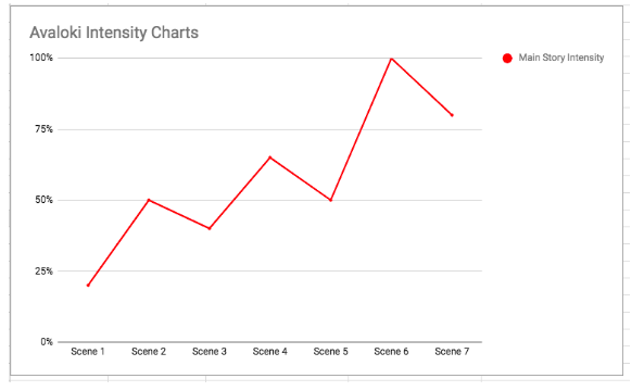
From here, I created an emotional intensity chart. This is breaking down, per story beat, how “intense” and moving the scene should feel for the viewer. e.g. The climax of the story should be the most intense. Other scenes should build up to the climax. (Adopted from the hero’s journey intensity breakdown, naturally!)


Then pit that intensity with a few distinct design elements that develop with the story and protagonists’ emotions:
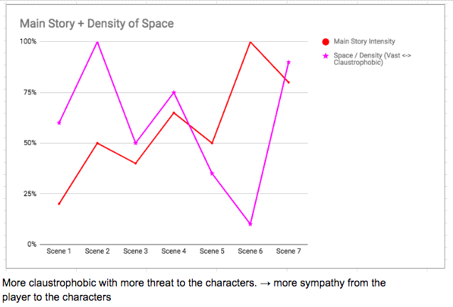
How should we utilize space as it relates to the user? When do we want them to feel closed in, to feel open, claustrophobic? KEY: Threat to the protagonists = more claustrophobic; more sympathy evoked = more vast space
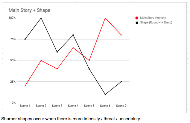
How do we use shape to visually the story intensity? KEY: Rounder shapes are friendlier; Sharper shapes occur when there is threat, intensity, uncertainty.
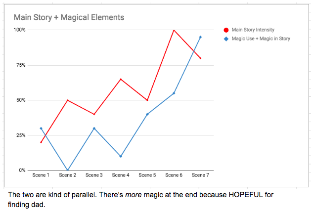
How much magic is taking part in the scene? KEY: There’s more magic at the end because there’s more hope for the protagonists to find their father.
This is integral for creating a cohesive, consistent visual guideline for designing each of the scenes.
It’s a bit of work at this stage but it makes designing and executing the specific design assets much easier during pre- and production! It also answers all the questions related to lighting, color, overall visual look and feel. This is how we build context as it relates to story. This is how we use visual design to tell a story all by itself, which makes for making an even stronger and more impactful story once the audio, music, editing, interaction is all added in!
From there, I could “assign” also design attributes to the scenes and characters to reinforce the above “visual guidelines”:
This is how we build visual meaning and context that reads subconsciously to the viewer. As the character’s story progresses, the visual design of the characters, environment, and scenes reinforce the character’s journey.
Research:
I dedicated some time to research Buddhist symbology. We used these as secondary and subtle design elements. This feeds into the mythology of the Avaloki world, especially when pertaining to the magical characters of the story.
Lotus: the lotus grows in muddy water, requiring resilience to break through the surface to bloom. It symbolizes the purity of enlightened mind arising amidst the cyclical nature of suffering (samsara).
Dharma Wheel: one of the major symbols of Buddhism that relate to its teachings
Mandala: a tool for meditation. “They are used to focus one’s mind during visualisation and meditation. In Shamanism and Tantric Buddhism, you create a sacred space in your inner universe and the Mandala can be an aid in achieving, remembering or even linking to that inner-universe.” (Source)
Painting Style for Tilt Brush Scenes:
Our director, Priyam, wanted to draw from traditional Japanese woodblock style. I loved this idea and this challenge to recreate flat, Japanese visual style in VR! I looked to Hokusai and Hiroshige for inspiration.
Conceptually for the story’s meaning, this visual style reinforced that these scenes are memories — the characters are discovering and remembering the past.
PREVISUALIZATION:
Top: Rough keyframe sketches & color studies
I sketched out roughs of each scene, applied rough color keys.
Bottom: Pixelated color studies, stretched to proportionally fit the time duration of each scene
This is the rough, as each user will have varying times in the cave. This helps us understand how the colors will progress over time in the VR narrative experience.
This utilizes color to help tell the story and context for the visual story. From here, the Director was able to edit the lighting and colors of the Cave scenes to lean more towards the colorscript. They were subtle changes but made huge impacts for the story overall. These are things most people won’t ever consciously notice but make a huge impact subconsciously.
Avaloki Tilt Brush Fishing, Scene 02:
Avaloki Tilt Brush Fox, Scene 04:
Avaloki Tilt Brush Fire, Scene 06:
Avaloki Poster Design
Staying true to the visual design theme of the VR Tilt Brush scenes, I wanted to directly draw from the Hokusai / Japanese blockprint style for the poster design.
Rough Ideations:
Concept & Exploration:
The line-work for the Avaloki poster was hand-drawn with ink on illustration board.
Official Avaloki poster art
Avaloki Poster, VR version — for fun! Final edition included at ending credits of the film.
ON THE CUTTING ROOM FLOOR:
In the early concept phases of The Avaloki, we didn’t have a cohesive visual language for the film just yet. We only knew we wanted to create a film with Japanese influence, but less defined with specifics. We went with a more anime, animation look for the film. This was the original design of the Fishing Scene. We loved how this looked, but it ultimately didn’t fit the subtleties and mystical nuances of the story we wanted to tell. Nonetheless, I still love this piece that didn’t make the cut:
Avaloki is a VR cinematic experience that is available for free, to be experienced on Oculus Rift. You can try it here: https://www.oculus.com/experiences/rift/1492953760771253/


